Solutions
What is a Solution?Copy

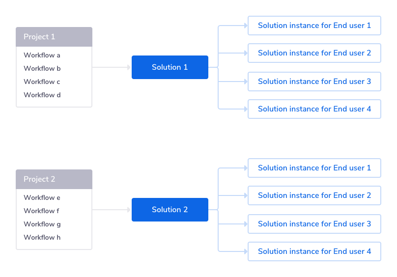
A solution is a Project that has been templatized so that anyone can activate an instance of it and personalize it for their own use.
Its primary components are:
All the workflows which make up the integration
The auth slots and config slots which can hold the auth and config data for each End User
A Solution Editor which allows you to control the layout of the Config Wizard
Viewing / creating Solutions in the Tray UICopy


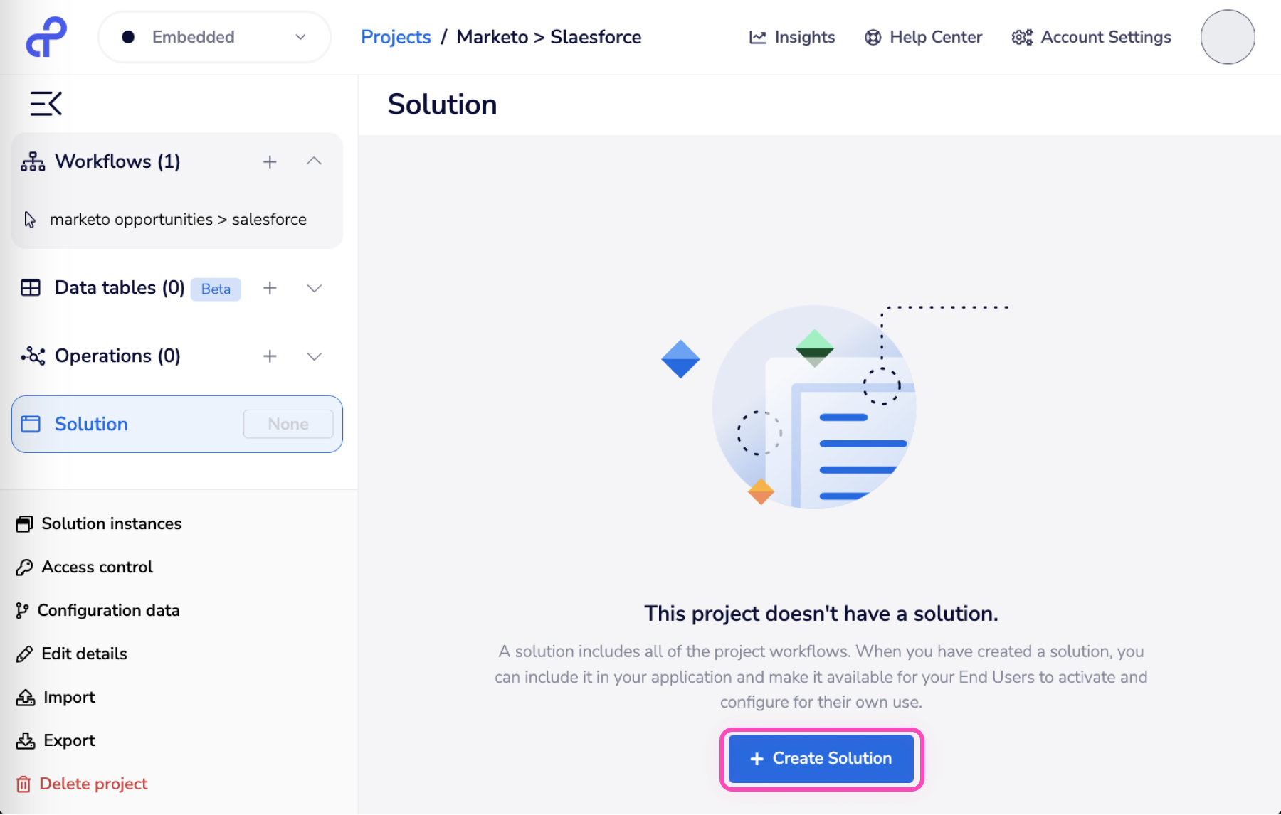
The Projects section of the Tray Embedded dashboard has following tags on Project tiles:
Live: This means that the project has a live published solution that is ready to be used by the End users.
Changed: This tag means some edits were made either in the workflows or in the config wizard of a live solution that haven't been published yet. The end users won't be able to use your changes until you publish the solution again.
Draft: This tag means a solution was created but has never been published.
None: This means you haven't created a solution for this project yet.
To turn any Tray.io project into a Solution, click on 'Create Solution' in the project details screen

The Solution EditorCopy


The Solution Editor is used for editing the available screens in the Config Wizard
It is divided into 3 Sections:
Left: Screens and Slots
Middle: Config Wizard Preview
Right: Advance Settings for slots
Each screen is automatically generated and, as per Google Sheets in Screen 1 of the above screenshot, will contain the auth and config slots for each service in the source workflows.
You can re-order the screens and can also move slots from one screen to another.
You can also hide slots so they won’t be seen by end users (useful for static auths or config)
Editing the Config Wizard componentsCopy


You can have several screens in the config wizard. On each screen you could have:
UI elementsCopy
Headline: This adds an H1 heading on the screen. Generally, you would want to keep this at the top to display the screen title. This is a required field which means you can't leave it empty if you add it.
Text: This adds a text box on the screen. You can use this to display relevant instructions for the screen. You can use Markdown to style the text. Here's an example that sets 'Mailchimp' in italics:


Spacer: This can be used to put blocks of space between components. It can accept absolute values in px or relative values (relative to the viewport height/screen height) in percentage.
Here's an example:

Auth slotCopy


Skip CTA: If checked, this will immediately open Tray's auth dialog box to add the auth as the user moves to a screen with auth slot. That means the end user won't be able to skip the auth. This could be done for the mandatory auths of a solution.
Skip CTA is behind a feature flag. Contact support if you wish to enable this.
Require unique auth for each instance: If checked, the end user won't be able to reuse the auth for the subsequent instances of this solution ie. The end user will be asked to create a new auth if they create another instance of this solution.
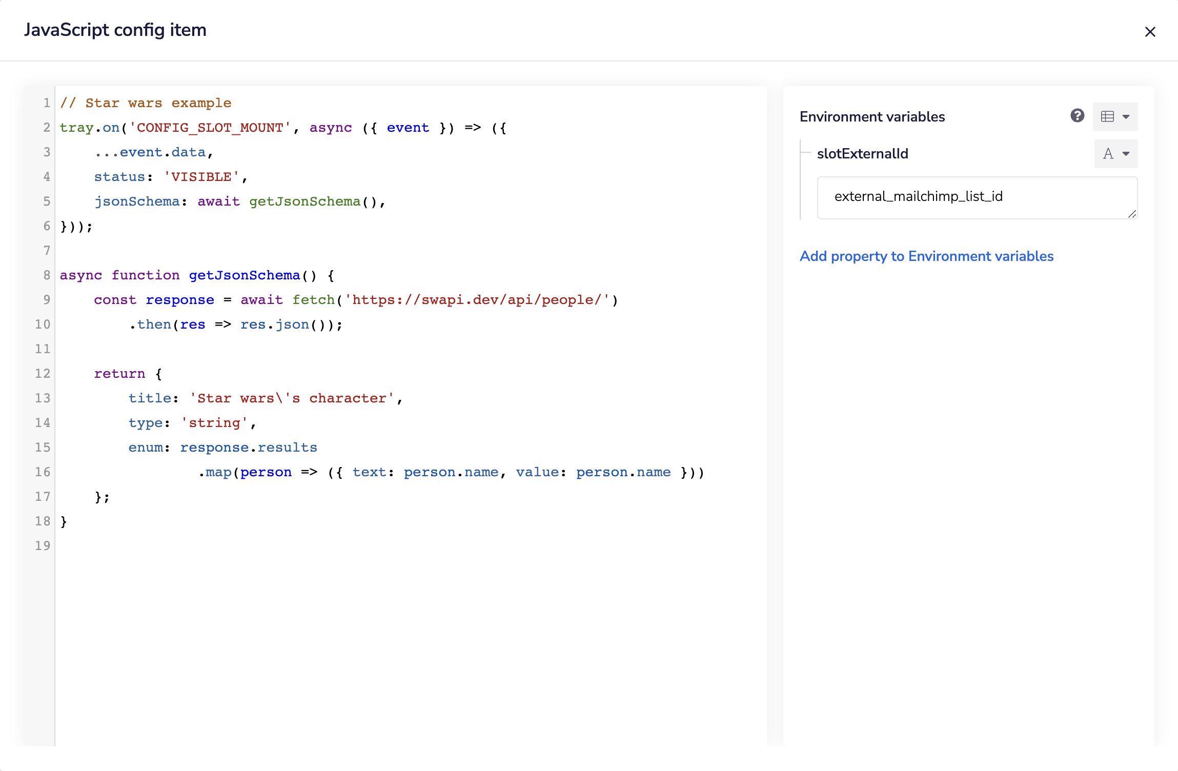
External ID: This is the unique ID of the slot. This can be used to identify the slot when capturing config wizard events in Custom JS.
Config slotCopy


Config label: This value appears on the screen above the slot.
Config default value: This is the default value of config as set in the source workflow. If the end user doesn't provide a value for the config while running the wizard, the default value will be used in the instance. Please note, if the 'Required Data' flag is set to true, the user won't be able to skip the slot.
External ID: This is the unique ID of the config slot that can be used for capturing config wizard events in Custom JS. Check examples here
Use config default: If checked, the Config default value is pre-selected in the dropdown list. The end user however can choose a different value in the dropdown.
Use data mapping: If checked, you can use this slot to configure the mappings for the integration. Check the Data mapping section for various options you can use:


Static list: If checked, the dropdown has static values:


Use custom JavaScript code: If checked, you can use Tray's Custom JS to display dynamic dropdown lists, apply validations, and show/hide slots dynamically. Check examples here.

Required data: If unchecked, the config slot is optional for the end user and they can skip it in the config wizard.
Allow custom values: If checked, the end user can write a custom value in the dropdown list.
Displaying available SolutionsCopy
Please see our API walkthrough for guidance on displaying Solutions to your End Users
Tagging SolutionsCopy
In Solution settings, it is possible to use tags to categorize Solutions.

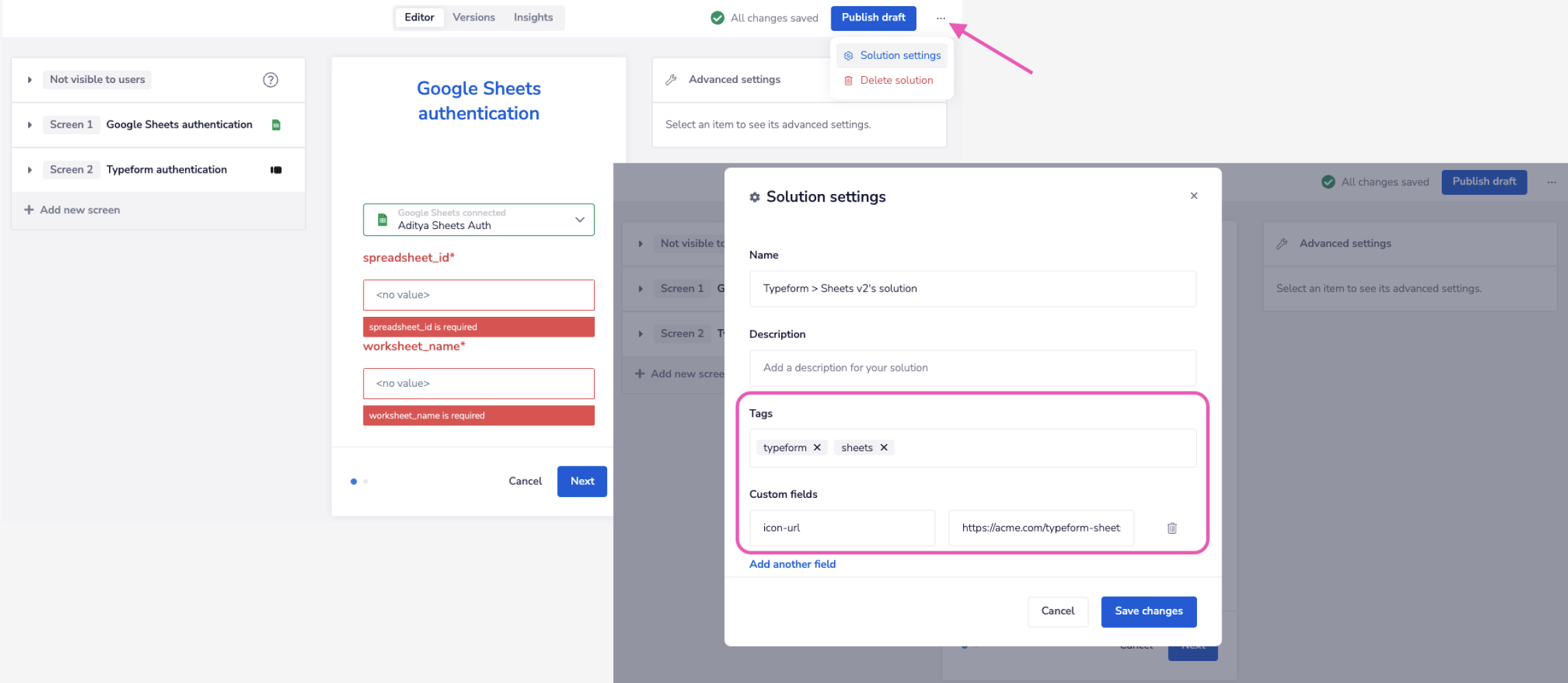
In your application you can then filter Solutions based on their tags, in order to control what integrations are shown to what End Users.
Deleting SolutionsCopy
As long as there are no Solution Instances derived from a Solution (i.e. as long as no End Users have activated Solution Instances, or all activated Solution Instances have been deleted via the API) Solutions can be deleted in the Tray UI:


You would see a number in brackets next to 'Solution Instances' if there are any. No solution Instances have been created for the solution above and hence it is safe to delete.
Deleting ProjectsCopy
As long as you have removed any derived Solutions and Solution Instances, it is possible to delete projects in the Tray Embedded UI:


After confirming that you want to delete the project you will be asked if you wish to keep any workflows for future use:


You will be informed if you are attempting to delete a project that has a solution:

